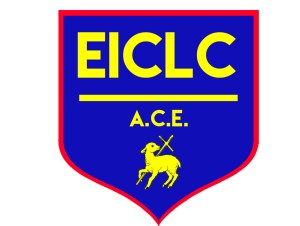

New patches are in for the EICLC uniforms. These patches, manufactured in the Philippines, represent the cleaner, simpler, and more elegant EICLC logo. It represents a fresh new start, as EICLC moves to its new, more spacious location at the Rock of Hope North Campus. The “EICLC” wordmark represents a more identifiable and unified vision of the school. Underneath, the “A.C.E.” acronym proudly displays the fact that the students are educated in the stellar Accelerated Christian Education program. An image of a cross and a lamb are identifiers carried over from the old logo, proudly signifying the school’s Christian roots.
The logo is more easily sizable than the old one. Though the patch is 3″, and the logo on this site is even smaller, the identification with “EICLC” acronym is visibly readable despite the size. The new logo also lines up with the school colors. The logo is rendered in the official primary royal blue and yellow. The logo also features a red trim. This is partly to set the patch apart when it is sewn into a royal blue uniform. It is also partly to include the school’s third color as trim. The combination of blue, red, and yellow also align with primary colors, and it represents EICLC’s commitment to making education the bedrock of our learning center.
